

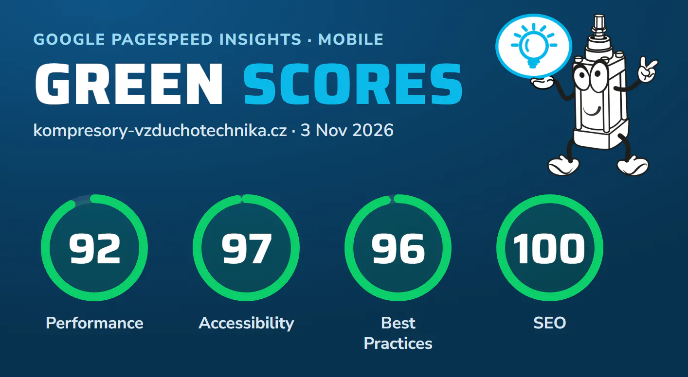
Since 24 July 2026 our online shop has been running on its own template, which we built from scratch. We spent three months fine-tuning and measuring it, and now Google gives us green scores: in the PageSpeed Insights test on mobile, performance 92 and SEO 100 out of 100.
Above all, though, the site has become faster for you. On a phone the page appears in under a second and responds to a tap instantly.
People often say that an online shop built on an off-the-shelf platform cannot reach green scores. We wanted to test that in practice, on a shop with more than 20,000 products in five languages. Here is what we did and what you get out of it.
What it means for you
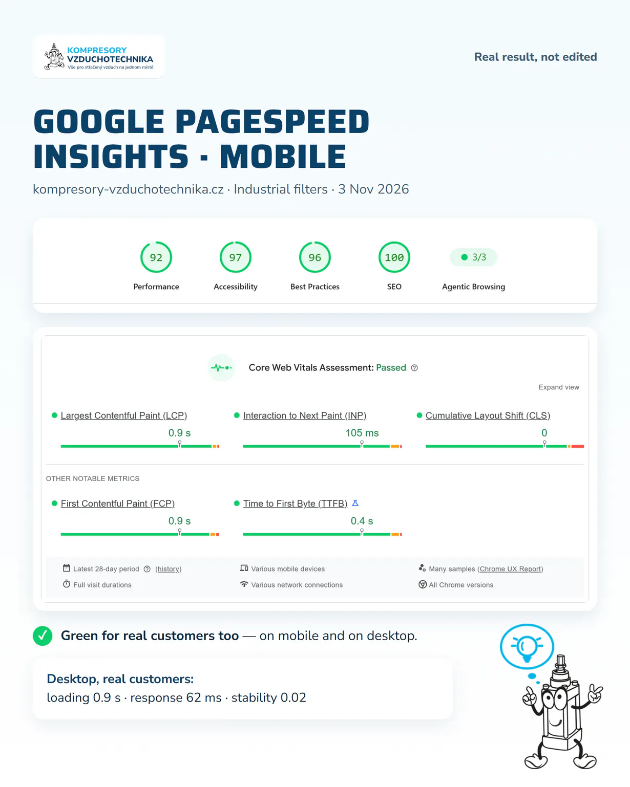
A lab test is one thing. But Google also collects anonymous speed data directly from the Chrome browsers of people who actually shop with us. According to that data, our site passes the Core Web Vitals assessment on both mobile and desktop.
Response is the time the site takes to react to a tap, for example on a filter or the Add to cart button. Zero layout shift means a button will not jump at the last moment, so you will not tap the wrong thing by mistake.
Before and after: how the site got faster
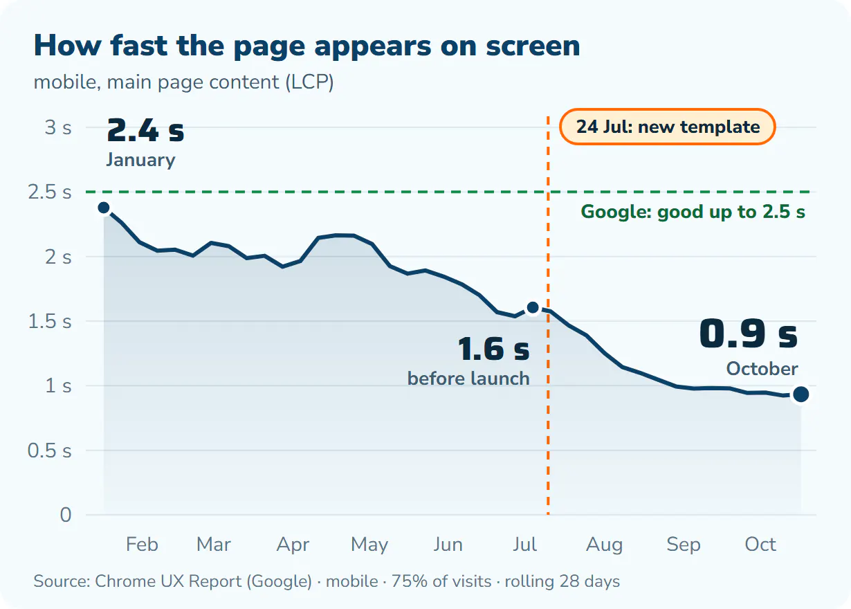
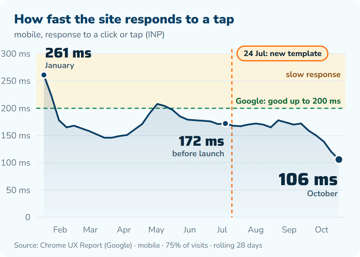
The charts show the trend since the start of the year, based on data from real customers. Each point is the value reached by three quarters of visits over the previous 28 days. The orange line marks the day we launched the new template.
Page loading: from 2.4 to 0.9 seconds
In January, a customer on a phone waited 2.4 s for the main page content, and 1.6 s just before the new template went live. After the launch, the time dropped below one second within a few weeks and was 0.9 s in October.
Since January, the site has become more than twice as fast on mobile.
Response: from 261 to 106 milliseconds
Response measures how quickly the site reacts when you tap a button, a filter or the menu. In January it was 261 ms, above the limit Google considers good. Just before the template launch it was 172 ms, and in October 106 ms, almost 40% less.
The biggest improvement came in September and October, when we sped up the template scripts. In early November we also sped up the cookie consent bar: in our measurement it now responds in 80 ms instead of 208 ms. This will show in the chart over the coming weeks.
What we did to the template
Shoptet offers a Blank mode: the shop keeps running on Shoptet, so the cart, checkout, stock and customer accounts stay the same, but you write the look and the code of the pages yourself. That is what we did.
- One clean template. Previously, the default design loaded first, with a second layer of changes on top that overwrote it. Now there is only one, written specifically for our shop.
- Each page downloads only what it needs. Styles and scripts are split by page type. Larger modules, such as the compressor selection calculator, only load when you need them.
- Space for content is reserved in advance. Images, menus and blocks have their space set aside, so the page does not shift while it loads.
- Fast response. We shortened and reorganised the code that reacts to clicks so that the browser does not have to wait.
- Technical SEO without flaws. Correct structured data for products (price, availability, ratings), clean breadcrumb navigation and a sitemap that links all five language versions.
- Images at the right size. We resized and converted the article images so that they have only as many pixels as are actually drawn on screen. They are now a third of their original size.
- Every change measured. Before an update goes live, it passes an automated test on mobile and desktop, including a run through the cart up to the order button.
The result straight from Google
We have not edited the result in any way. It is a cut-out from the Google PageSpeed Insights page of 3 November 2026 for our Industrial filters category. At the top is the lab test, below it the data from real customers over 28 days.

Ventilek advises
Running the test yourself? The Performance score may come out a few points different.
PageSpeed tests the page on a simulated slower phone, and the performance score varies from run to run even when nothing on the site has changed. The Core Web Vitals Assessment section is more reliable. That is data from real visitors, and ours is green.
How we went about it
We built the template ourselves. We had help from the AI Claude: it proposed changes, wrote code and tested and measured every change on a trial basis first. The decision on what went live and when was always ours.
Speed is not a one-off project for us. We keep measuring the site and are working on further improvements.
Frequently asked questions
- Has anything changed when shopping?
- No. The cart, checkout, customer account, delivery and payments work exactly as before, just faster.
- Does this also apply to the Czech, Slovak, Polish and German versions?
- Yes. All five language versions run on the same template.
- What are Core Web Vitals?
- Three metrics Google uses to measure how a website actually feels to use: how quickly the main content appears (LCP), how quickly the site responds to a tap (INP) and whether the content shifts while loading (CLS). Google also takes them into account when ranking search results.
Try it yourself
The best test is simply to browse the site. For example the compressors category, where the calculator works out straight away which machine you need. If you are not sure what to choose, call us on +420 311 532 091 and we will be happy to help.